Nano2 Theme – Fully responsive and based on Warp 6.2
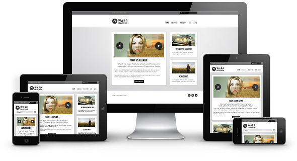
Now we are very proud to present you Nano2, our first completely responsive theme! It takes full advantage of the brand new Warp 6.2 theme framework, that we have been working on for the last months. Warp 6.2 comes with a completely responsive design which adapts perfectly for all device resolutions.
Nano2 is the successor of our very popular Nano theme. Like its predecessor Nano2 is an optimized and streamlined framework theme and serves as a blueprint to build your own custom themes. We revamped all the existing Nano styles and made them responsive. They look fresher now and adapt perfectly for different screen sizes. In addition, we added 3 new styles to cover all kinds of different layouts. These styles are a great starting point for you to design your own customizations, modifications and enhancements.
- Fully responsive layout
- Available for Wordpress and Joomla 2.5
- 8 style variations available
- Choose from 5 colors and 8 fonts
- 1 module style combinable with 4 badges and 6 icons
- Flexible template and column widths
- All Warp framework features are available
Responsive Design
The basic idea of responsive design is to have a layout that is not bound to a particular screen size, but instead adapts flexibly to different device resolutions. To achieve this the Warp 6.2 framework offers all the tools you need: A fluid grid sytem, fluid images and media, CSS media queries, breakpoints and corresponding JavaScript functions. Learn more in our blog posts about the layout and CSS parts and the JavaScripts parts.
Responsive Master Theme
Of course, we also updated our famous Master theme. This theme is the perfect blueprint to create responsive themes based on the Warp 6.2 framework. Compared to the Nano2 theme it is completely stripped down, has no styles and includes only the neccessary basics. It is GPL licensed and available as a free download for Joomla and WordPress.
Warp 6.2 Backward Compatibility
All older Warp 6 based themes can be updated to Warp 6.2. But they'll still continue to use the mobile theme and not the new responsive features. If you want to make your theme responsive you need to take a look at the Nano2 theme, see how this is accomplished and make your own modifications.
Some Warp features are deprecated and will not be available in Warp 7 like the Mobile theme, CSS3Pie, IE CSS files and some CSS classes (see changelog). If you update your own themes, remember that in Warp 6.1.11 we've already changed the search to use a CSS class instead of an ID (#searchbox to .searchbox).
Widgetkit Is Responsive
As icing on the cake we introduced the brand new responsive Widgetkit 1.1 last week. All widgets including all the fancy effects are now adapting perfectly for smaller screen sizes. That way, the new Widgetkit is usable for all devices and is also future-proof. Besides bugfixes we've added more nice little features. Take a look at this Nano2 page, resize your browser window and see the responsive Widgetkit in action. Read more about the Widgetkit 1.1 release here.


