MiCasa Theme
November 2012 YOOtheme club theme
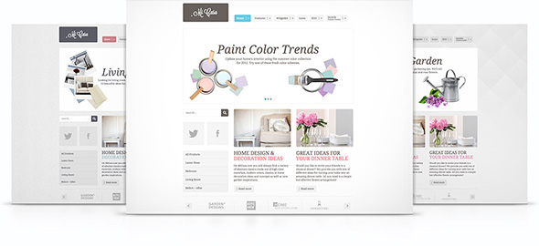
Welcome our brand new MiCasa theme! Its plain modern style is complimented by pastel and muted colors as well as rounded box shapes. MiCasa will be perfect for all of you running a website associated with home and (life)style or fashion but it easily works for many other sites as well.
As a prominent eye catcher, we have integrated the front page slideshow for your teaser pictures, enhanced with the popular rotate effect from our latest Widgetkit version. The second custom Widgetkit style we created for MiCasa is the elegant semi-transparent slideset with smooth CSS hover effects. And of course, we also added a matching set of social icons that come in a box style with rounded corners.
Now, on to the variations: MiCasa offers you a range of 8 different styles as well as 8 beautiful backgrounds and 12 fonts to be freely combined with 3 secondary colors. Too many choices? Well, we’ve also included a selection of predefined profiles using the different styles, colors and fonts which you can select from in the theme administration. And just in case you were wondering - MiCasa also fully responsive and built on the latest version of our fast and slick Warp Theme Framework.
- Available for Joomla and WordPress
- Provides a fully responsive layout
- 8 style variations available
- Choose from 8 colors, 3 secondary colors and 10 fonts
- 4 module style combinable with 4 badges and 6 icons
- Custom Widgetkit styles for slideshow and slideset
- Flexible theme and column widths
- All Warp framework features are available

Comments (39)
jakob.gede
Thank you YOOHTEME for your perfect products!
michael.hani
bryan.wongsopawiro
But love the new widgetkit style!
ray.lawlor
This theme is much more original than the last few, which were rehashes of old templates.
This is very much back to form! Well done yootheme!
adam.bako.27
again a little bit simple design but looks good..
thanks
jeroen.vranckaerts
Especiallty the background could use more contrast / variation, too much white for my tastes
A mostly white site on a white background is often perceived as an unfinished / unpolished design, even when it's deliberately chosen
ray.lawlor
greenparrot
background: black;}
flytreklame
I dont understand complaints about color and backgrounds. If you don´t know how to modify a template to make it look what you want it to, maybe you should hire someone who knows?
Read the documentation!
pablo.daniel.lopez.99
panagiotis.apostolides
jeroen.vranckaerts
What i meant flytrek is that in the last five themes four of them are mostly white (MiCasa, Sync, Sphere, Nano2).
Personally, what i'd like to see most would be a Yootheme version of the Windows 8 "Modern UI", like the Metro UI CSS project ( http://metroui.org.ua)
panagiotis.apostolides
plz make something more creative your framework rocks your last themes note so...
viktor.horst
thomas.schulz.53
corwin
sebass
Love the framework guys, still don't know why you don't get more love out there from the "Mainstream WP Media"
imagine333
Nice template.
@all If you want real rocking templates??? Build them yourself.
Otherwise don't complain and customize Yootheme's templates!!
largeproductions
Nice work :)
drjonz
ryan.jones
ben.carter.84
webgeeze
dr6sigma
Dear YOOTheme users,
As you know there are many Joomla (Wordpress) theme developers out there... YOOTheme provides a very stable well supported at a very reasonably priced platform to work from. Do not be so hung up on the base colors and designs presented each month but rather look at the module positions and associated styles offered. For example, I have three sites based on the Subway theme and for the non-trained YOOTheme eye would never know it is the base theme.
Dear YOOTheme,
You have power in your core clients whom work day in and day out designing websites, which should primarily be focused on the Voice of the Customer. At my day job (I am a Six Sigma Black Belt Consultant holding 2 master degrees and about to graduate with my PhD), one of the programs I have designed, launched and managed for the world's largest insurance company focuses on sequestering ideas from those whom work the "front lines" and are closest to where improvements can be had. That program is called "Bright Idea" to make incremental non-capital improvements. You should create an intake from to sequester ideas from your core clients for new theme designs. You could even make a contest out of it and name that theme after the winning submitter... Say twice per year our once per quarter...
Anyways... keep up the good work!
Richard
carl.gerhard.wieners
tobypsl
In terms of next templates I'd like to see a busines to business professional services template and in terms of style a mash between a dark and a clear template - this would be novel.
wesley.dowdell
The sign up for the news letter section on this demo...presume there is no actual code for that just the design?
The theme is quite nice, I am going to use it for my wife's hair salon site.
michele.de.filippi
george.anderson
joy.design.studio
dr6sigma
deschateaux.laurent
For example i need a template like this : http://www.adidas.de/
Tks
dr6sigma
berndwolter
tvoutour
blunoa
greg.van
kelly.mcclain
peter.daalmeer