Theming with UIkit – Best practices to create a UIkit theme
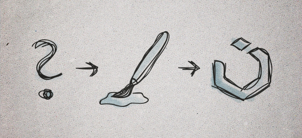
Today we'll show you how easily you can add your own styling to UIkit. First off, some fundamental HMTL and CSS knowledge and the basics of LESS are required.
The Basics
Let's talk about how theming in UIkit works. Each UIkit component is defined by a LESS file. LESS can not be interpreted by browsers and has to be compiled into browser friendly CSS. For that reason we use the Node.js based task runner Grunt. Once activated, it watches the directory you are working on and compiles all LESS files into one single CSS file, whenever you save a change. Learn more about this here.
On our website you can customize UIkit and download the compiled and minified CSS. For an uncompiled version of UIkit, including all source files, clone the GitHub repository. Once downloaded, you can style your theme by using variables and hooks to add your own styling to a selector. If you don't know how to clone, fork and send pull requests, take a look at the GitHub help.
Get started
Let's have a look at a little example of our recommended workflow. You will see that working with UIkit themes is pretty straightforward, once you are familiar the workflow and structure. We will begin by working directly in the source files. After cloning the UIkit repository, you will have the following file structure:
| Folder | Description |
dist |
Contains all distributed compiled and minified CSS and JavaScript files, as well as fonts. |
docs |
Contains the very UIkit documentation you are looking at right now. |
src |
Contains all UIkit component files and fonts, organized into the sub folders less, js, fonts and themes. |
src/themes |
Contains all themes and their related LESS files. |
tests |
Contains test files of all UIkit components. |
vendor |
Contains external libraries. |
Create a new theme directory
Add a new folder inside /src/themes, create a uikit.less file inside this folder and add the @import "../../less/uikit.less"; rule to access the default LESS files. That‘s it! You can start adding your own styling to the default UIkit theme. Alternatively we recommend duplicating and renaming the blank theme to add your styles. It already provides all imports and theme files with their related hooks. There are a number of different ways to add your own styling to a UIkit theme.
Change the values of variables
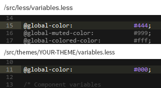
@global-color variable in the /YOUR-THEME/variables.less file and add our own value. This is because the body selector is set through the variable value @base-body-color in the /less/base.less file, while the @base-body-color is declared by the global variable @global-color in the /less/variables.less file.
Note: UIkit distinguishes between global variables and component variables. Global variables are set to declare component variables, which are intended for use in their related components.
Use hooks to create new declarations
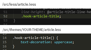
/less/article.less file. You will see that there is a hook .hook-article-title. Open your /YOUR-THEME/article.less file, where you will find the same hook. Just add the text-transform: uppercase; property and you‘re done!
Create your own selector
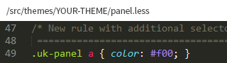
.uk-panel a selector to your /src/theme/YOUR-THEME/panel.less. That's it, no sorcery!
Compile your theme
Once you have finished customizing your theme, run Grunt to compile all LESS files. You will find your final theme CSS file in the /dist folder of your UIkit installation.
