DevStack – A Software Theme for WordPress and Joomla
It's theme time again! Today we are excited to present DevStack – our new theme package for WordPress and Joomla. It's perfect for software as a service (SaaS), app or any other product-related websites. This is the first theme in a long time that switches the focus from dynamic content back to design and style. For DevStack we mixed the two currently most popular design trends – neomorphism and glassmorphism, to create a unique look. DevStack also comes with 16 modern page layouts, great looking styles and many handcrafted icons and illustrations. Let's take a look.
Make sure to subscribe to our YouTube channel and join our Discord Chat Server for all news and discussions.
Page Layouts
DevStack comes with 16 different layouts for all kinds of page types. They can easily be loaded from the layout library with just a click. Here is a walk-through of all the highlights.

Home

Why DevStack

Enterprise

Pricing

Support

Feature Index

About

Our Story

Careers

Job Description

Post Index

Post Category

Post

Author

Search

Error 404
| Page | Type | Description |
|---|---|---|
| Home | Page | The Home page shows the product hero section with a presentation video followed by multiple feature sections. Next comes an overlay slider with latest customer stories. The page ends with a call to action section and latest blog posts. |
| Why DevStack | Page | The Why DevStack page shows a feature navigation to dedicated sections presenting the features one by one. The highlights of this page are two panel sliders for 3rd party integrations. They have a smooth effect due to the different autoplay intervals. The page ends with a pricing section. |
| Enterprise | Page | Similar to the page before, the Enterprise page shows the feature navigation but in a primary section. Each feature section stands out with its own layout. The customer stories are presented in an overlay slider followed by a grid with community benefits. There is also a pricing section at the bottom. |
| Pricing | Page | The Pricing page shows all subscription plans. You can even switch between monthly or annual pricing. Next comes a table comparing the plans followed by FAQs. |
| Support | Page | There is also a typical support page that starts with a prominent search bar at the top followed by grids and lists to the documentation, hot topics, popular tutorials and recommended articles. |
| Feature Index | Page | The Feature Index page is a completely new layout type. It shows a full list of all features with a short description and a link to their detail page. There is a sidebar on the left linking the specific feature groups to their sections. |
| About | Page | The About page shows the information about the company and its values. There is also a small subnav to further company pages. The office images are shown in an overlay slider followed by the company team presented in a masonry grid with a slight parallax effect. Next comes a panel slider with quotes from different team members. |
| Our Story | Page | Our Story is our first timeline page. It starts with a hero section followed by a timeline showing the company's progress over the years. |
| Careers | Page | As the name suggests, the Careers page is used to present all open positions. It starts with a beautifully arranged hero section followed by a list of benefits and an image gallery. Of course there is also a list of open positions as well as a call to action. |
| Job Description | Page | The Job Description page is a detail page for a specific position. It provides all the needed information like responsibilities, qualifications and a contact link. |
| Blog | Template | DevStack also has a Blog page that shows the latest news in a three-column layout. It starts with a newsletter sign up and a subnav to filter posts by category. |
| Post Category | Template | The Post Category page looks the same as the page before, but without the newsletter at the top. Instead, there is a link back to the blog page. |
| Post | Template | The Post page starts with the post image. The post itself is shown in a three-column layout with the content in the center, meta information on the left and author information on the right. The sidebar on the left also shows post tags as well as links to social media profiles. Latest posts are shown at the bottom. |
| Author | Template | The Author page starts with the author image, name and description. It is followed by all author posts displayed in a three-column layout. |
| Search | Template | There is also a Search page with the search form on the support page. The search results are shown in a one-column layout. |
| Error 404 | Template | Finally, DevStack has a clean 404 Error page with a link back to the home page. |
Pricing Table
In order to create a pricing table which allows switching between monthly and annual subscription plans, we came up with the idea of using of the Grid element and its filter option. Not bad, right? 😃 But for a common pricing table, we had to add some new options to the Grid element. You can now set a different panel style and link text for each grid item, and the button can now take the full width of the card.

Background Squares
To emphasize the neomorphic style, DevStack uses absolutely positioned images in the background across all layouts. These white squares fade in protruding from the background which creates even more depth. Since the hero sections of the Why DevStack and Enterprise pages contain many animated elements in addition to the background squares, the default animation delay of 200ms took too long. That's why we added a new option for the delay time to speed things up.

Style
DevStack is all about Neumorphism also called Soft UI. Elements and the background have the same color, and using shadowing and light creates the feel that elements like buttons and cards are protruding from the background. Forms, on the other hand, sink into the background adding another layer of depth. To achieve this we added new box shadow options across many UI components to the style customizer. Even the dividers have a subtle shadow effect. A pale color scheme and round borders create a silky-smooth surface, while flashy gradients bring attention to active states and important UI elements. To refine the style even more we added a little bit of glassmorphism which is why the sticky navbar has a frosted-glass effect using a background blur. Finally, DevStack has bold typography with a san-serif font.

In addition to the default style DevStack comes with 5 other style variations, each with a different beautiful color scheme. There are three light styles and two dark ones. Of course, you can switch the whole look and feel of your website with just a click. Simply choose what fits your website best!

Light Green

Light Orange

Light Blue

Dark Red

Dark Purple
Navbar
To create a frosted-glass effect for the sticky navbar we added the Backdrop Filter option to blur the background. There is also an additional Mode for the navbar border which only shows the border when the navbar is sticky. And finally, there is a new Slide Mode for the navbar line which starts the line animation from the center expanding it to both sides.
Animated Hover Cards
We added a new transform option to all cards. This allows us to reposition the card on hover. Together with the box shadow animation it creates an interactive look as if the card is being pushed down.
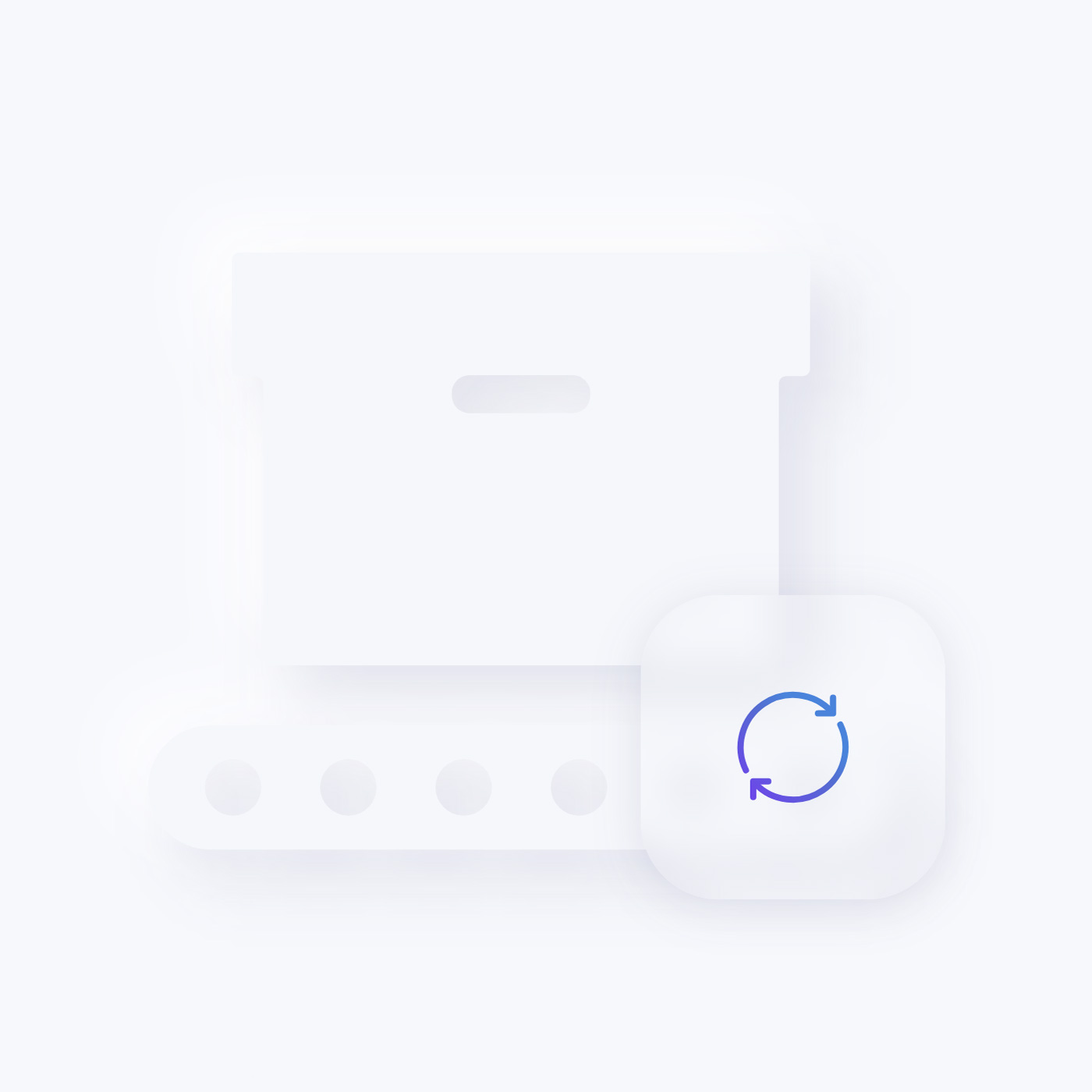
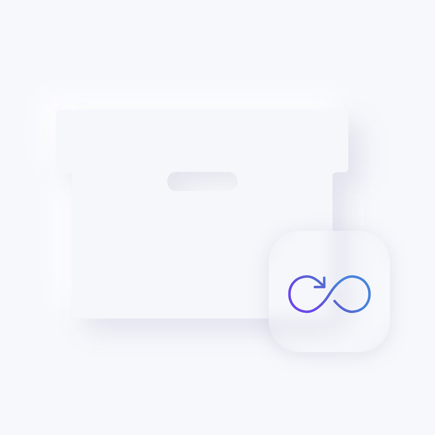
Glassmorphic Illustrations
What comes next is something we are especially proud of. We created unique animated SVG illustrations for all DevStack features. In the background we have a large neomorphic icon. On top a square is floating with a subtle parallax animation. It has a frosted-glass effect using a background blur and displays a vibrant icon. It was a bit tricky to get them working across all browsers, but we did it.
Background Images
For some features we created animated background SVG images using a subtle parallax effect.
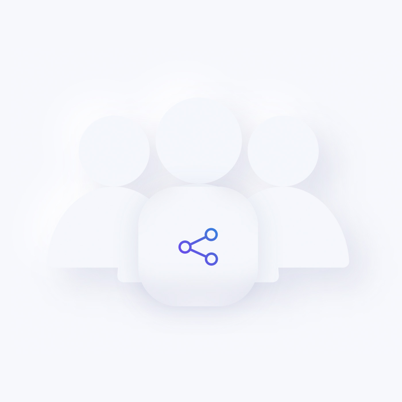
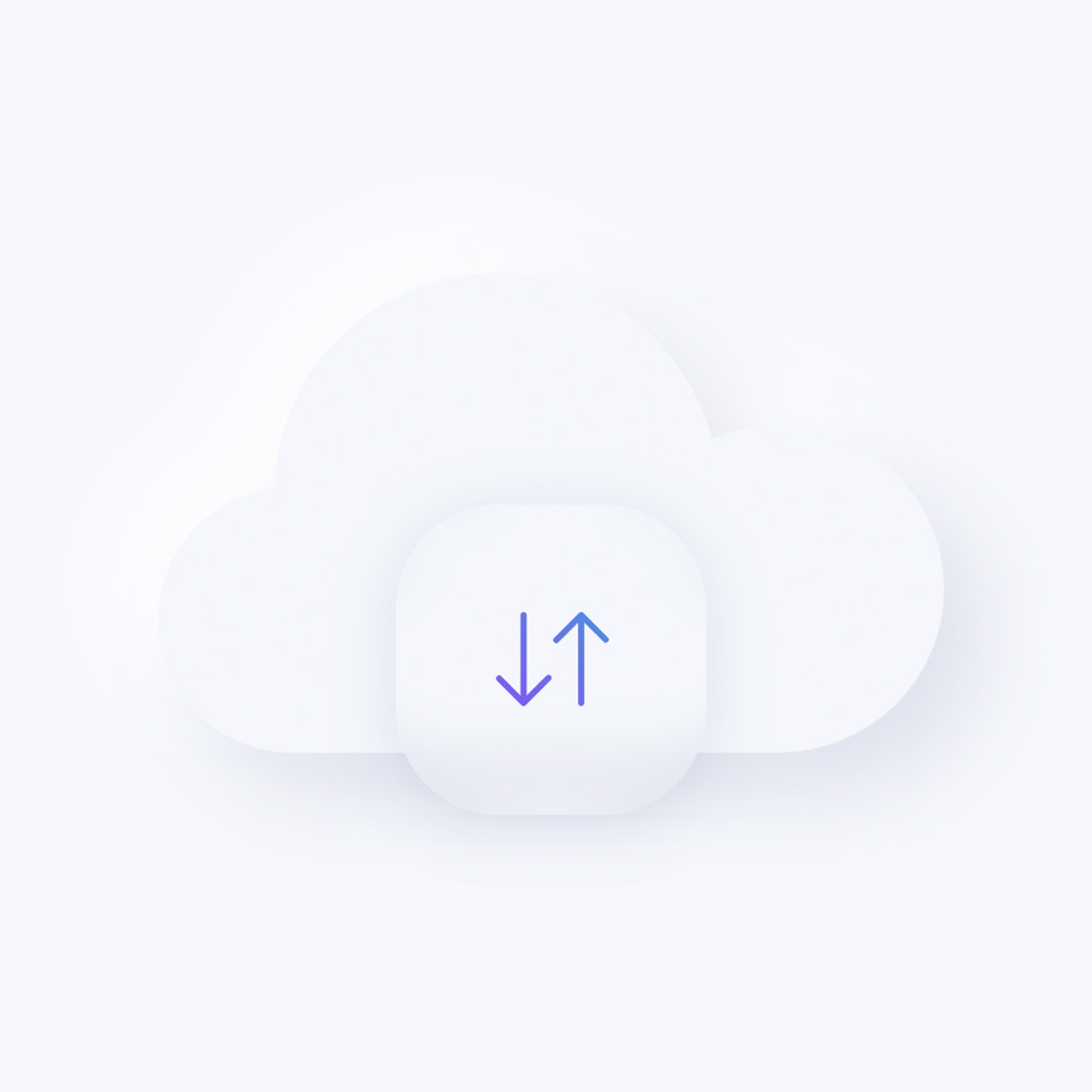
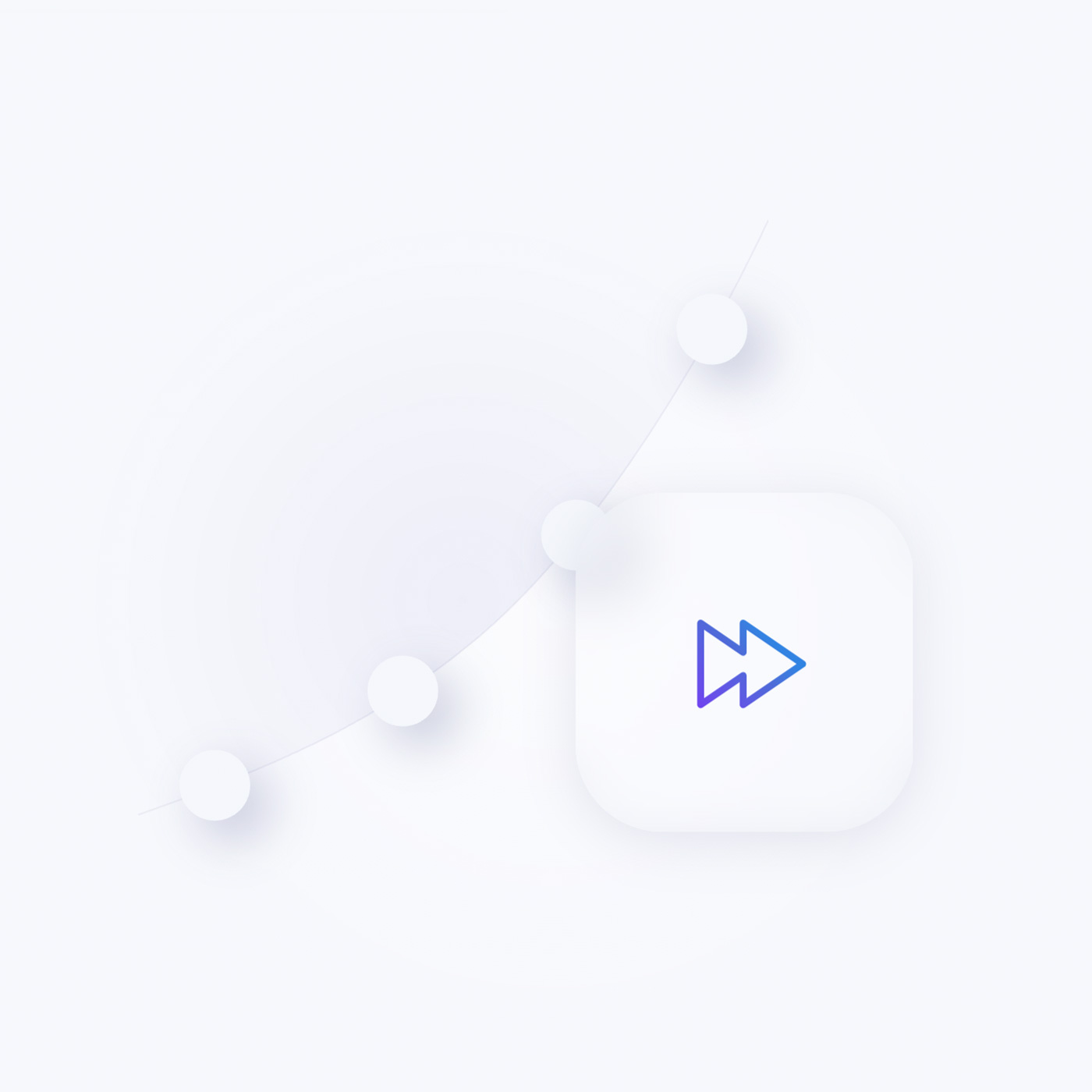
Neomorphic Illustrations
Smaller features are presented using neomorphic squares with vibrant icons.
Handcrafted Icons
There are even more other icons that show DevStack features. Of course, you can change their color and use them with any style.
Content Types and Custom Fields
Since DevStack does not focus on content structure, it only uses dynamic content for its blog and post pages.
Post
The default Post has 3 custom fields to tease the post on other pages.
| Post Field | Type (J) | Type (WP) | Description |
|---|---|---|---|
| Intro Image | - | image | Intro image used to tease the post |
| Teaser Image | media | image | Teaser image used to tease the post |
| Teaser Image Alt Text | text | text | Teaser image alt text |
Author
In Joomla the User has 5 custom fields to display the avatar, biography and social media links while in WordPress only two fields were added since the rest is available by default.
| User Field | Type (J) | Type (WP) | Description |
|---|---|---|---|
| Image | media | - | User image |
| Image Alt Text | text | - | User image alt text |
| Description | textarea | - | User biography |
| Job Title | textarea | textarea | User job title |
| Socials | repeatable | repeater | The links to social media profiles |
Free Quality Stock Images
DevStack comes with more than 60 lovingly curated and free-to-use images. They can be found in the DevStack collection in the Unsplash library.

3rd Party Integrations
The Joomla and WordPress demo websites make use of several 3rd party plugins. We support Advanced Custom Fields, Toolset, Custom Post Type UI, WordPress Popular Posts, the Regular Labs Articles Field and more. For more information on all pre-installed and activated plugins, take a look at the installation documentation for Joomla and WordPress.
So these are the features of our new DevStack theme package for Joomla and WordPress. Now go ahead and explore it yourself. As always, let us know what you think in the comments below.
- Software as a Service (SaaS) website
- 16 premium page builder layouts
- 6 beautiful neomorphic styles
- 60+ lovingly curated and free-to-use images
- Ready-to-use Joomla and WordPress demo websites


