Builder Elements
Custom elements are the easiest way to extend the functionality of the YOOtheme Pro page builder. Copy an existing element and customize its markup and settings, or create a new element from scratch.
Custom elements can be added to the page builder by using a child-theme or a Joomla plugin. The easiest way to add an element is by using a child theme. This is typically used for client projects. A Joomla plugin should be used when developing a third-party extension for YOOtheme Pro. Take a look at the extensions page to see what is available from the developer community.
Getting Started
The easiest way to get started is to try out the example element or take a look at the included YOOtheme Pro elements. Once the element is added to the page builder, it will appear under Custom in the element library.

Example Element
The example element on GitHub demonstrates how to configure an element, extend its functionality and make use of the different field types. Simply download and unzip the element. The quickest way to try it out is using a child-theme.
Included Elements
Included elements can be found in the respective module directory under packages in YOOtheme Pro.
| Directory | Elements |
|---|---|
builder/elements |
accordion, alert, button, code, column, countdown, description_list, divider, gallery, grid, headline, html, icon, image, layout, list, map, overlay, panel, popover, quotation, row, section, slider, slideshow, social, subnav, switcher, table, text, totop, video |
builder-newsletter/elements |
newsletter |
builder-joomla/elements |
breadcrumbs, module, module_position |
builder-wordpress/elements |
breadcrumbs, module, module_position |
builder-joomla-source/elements |
pagination |
builder-wordpress-source/elements |
comments, pagination |
To create a new element by customizing an existing element, simply copy one of the included elements and give it a unique name in the element.json configuration.
File Structure
An element has its own directory with configuration and template files.
| File | Description |
|---|---|
element.json |
Define the element configuration, fields and settings. |
element.php |
Extend the element functionality with custom transforms or update functions. This file is optional and has to be imported through the element.json. |
templates/template.php |
Render the element layout. The rendering is often split into template partials prefixed with template-. |
templates/content.php |
Render the element content without layout-specific markup. The content is saved in the Joomla page. It's used by the Joomla search and remains when discontinuing using YOOtheme Pro. |
images/icon.svg |
The icon shown in the element library |
images/iconSmall.svg |
The icon shown in the page builder |
JSON Configuration
The element.json defines the element's name, icons, fields and how the editing interface should look like inside the builder. Make sure to set a unique element name, for example my_element, that is not taken by an existing element. The following example shows a simple element configuration without any fields.
{
    "name": "example",
    "title": "Example",
    "icon": "${url:images/icon.svg}",
    "iconSmall": "${url:images/iconSmall.svg}",
    "element": true,
    "width": 500,
    "templates": {
        "render": "./templates/template.php",
        "content": "./templates/content.php"
    }
}| Property | Description |
|---|---|
name |
Name of the element. Must be unique. |
title |
Label in the page builder |
icon |
Path to the icon used in the element library |
iconSmall |
Path to the icon used in the page builder |
element |
Show element in the element library. |
width |
Width of the customizer sidebar when editing the element |
templates |
Paths to the two required template files |
Group Property
By default, custom elements are grouped under Custom in the element library. To create a dedicated group for elements, set the group property. This is recommended if elements are shared across different projects or when developing a third-party extension for YOOtheme Pro.
"group": "my company"
Fields
Fields of an element can be defined in the fields object in the element.json file. Just add a field name and its field definition.
"fields": {
    "my_field": {}
}
Additionally, set all fields in the default fieldset object to define their order and layout when editing the element in the page builder.
"fieldset": {
    "default": {
        "fields": [
            "my_field"
        ]
    }
}
Properties
Every field is defined by its type and further properties. The following properties are available for all field types.
| Property | Description |
|---|---|
name |
Name of the field. When not set, inferred from the object property key. |
type |
Set the field input type. By default it's text which displays an input field. |
label |
Display a field label above the field. |
description |
Display a field description below the field. |
attrs |
Add additional HTML attributes to the rendered field. |
show |
Show field only if a specific condition is met. |
enable |
Enable field only if a specific condition is met. |
In the following example an input field named Content is shown.
"fields": {
    "content": {
        "label": "Content",
        "description": "A description text.",
        "attrs": {
            "placeholder": "Enter text"
        }
    }
},
"fieldset": {
    "default": {
        "fields": [
            "content"
        ]
    }
}
In the following example the style option can only be selected if the content field is filled out. The icon picker is only shown if the content field is filled out and the style is set to primary.
"fields": {
    "content": {
        "label": "Content"
    },
    "style": {
        "label": "Style",
        "type": "select",
        "options": {
            "None": "",
            "Primary": "primary",
            "Secondary": "secondary"
        },
        "enable": "content"
    },
    "icon": {
        "label": "Icon",
        "type": "icon",
        "show": "content && style=='primary'"
    }
},
"fieldset": {
    "default": {
        "fields": [
            "content",
            "style",
            "icon"
        ]
    }
}
Tabs
Optionally, the fieldset object type can be set to tabs which defines different tabs in which the fields are shown. The following example has two tabs – Content and Settings. The Content tab includes the content field, and the Settings includes the two option fields.
"fields": {
    "content": {
        "label": "Content"
    },
    "option_a": {
        "label": "Select",
        "type": "select",
        "options": {
            "Option 1": 0,
            "Option 2": 1,
            "Option 3": 2
        }
    },
    "option_b": {
        "label": "Checkbox",
        "type": "checkbox",
        "text": "Some text"
    }
},
"fieldset": {
    "default": {
        "type": "tabs",
        "fields": [
            {
                "title": "Content",
                "fields": [
                    "content"
                ]
            },
            {
                "title": "Settings",
                "fields": [
                    "option_a",
                    "option_b"
                ]
            }
        ]
    }
}
Default Values
Fields can be set to a default value when the element is added to the page builder. Simply set the field key to the default value in the defaults object in the element.json file. In the following example the text field content will be filled out with Some default value..
"defaults": {
    "content": "Some default value."
},
"fields": {
    "content": {
        "label": "Content",
        "type": "textarea",
        "attrs": {
            "rows": 6
        }
    }
},
"fieldset": {
    "default": {
        "fields": [
            "content"
        ]
    }
}
Preview Placeholder
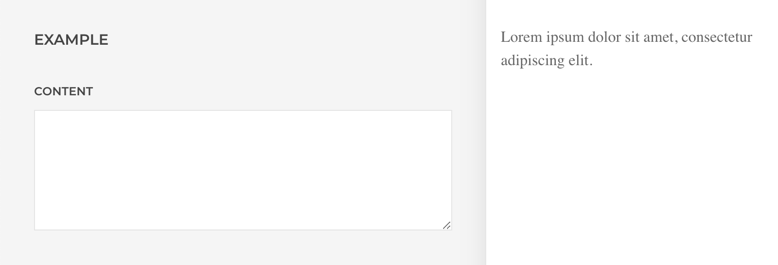
Fields can show a placeholder in the page builder preview while it has no content. Once the field is filled out, the placeholder disappears, and the field value is shown. Simply set the field key to the placeholder value in the placeholder object under props in the element.json file. In the following example the element will show a Lorem ipsum placeholder text as long as the content field is not filled out.
"placeholder": {
    "props": {
        "content": "Lorem ipsum dolor sit amet, consectetur adipiscing elit."
    }
},
"fields": {
    "content": {
        "label": "Content",
        "type": "textarea",
        "attrs": {
            "rows": 6
        }
    }
},
"fieldset": {
    "default": {
        "fields": [
            "content"
        ]
    }
}
Interpolation Syntax
YOOtheme Pro comes with powerful interpolation syntax to reference values and to call functions. These interpolations are embedded within strings and wrapped in ${}, such as ${var.foo}.
For example, this is used for general element settings which are often the same across elements. Those fields are defined in the packages/builder/config/builder.json file. Their field definition can be referenced as ${builder.NAME}. The following example sets the field name maxwidth to the field definition defined in the builder.json file.
"fields": {
    "maxwidth": "${builder.maxwidth}"
},
"fieldset": {
    "default": {
        "fields": [
            "maxwidth"
        ]
    }
}
Here is the referenced field definition from the builder.json file.
"maxwidth": {
    "label": "Max Width",
    "description": "Set the maximum content width.",
    "type": "select",
    "options": {
        "None": "",
        "Small": "small",
        "Medium": "medium",
        "Large": "large",
        "X-Large": "xlarge",
        "2X-Large": "2xlarge"
    }
}
Another example is the advanced settings tab which is also the same across all elements. The order and layout of these fields are also referenced from the builder.json file.
"fields": {
    "content": {
        "label": "Content",
        "type": "textarea"
    },
    "name": "${builder.name}",
    "source": "${builder.source}",
    "id": "${builder.id}",
    "status": "${builder.status}",
    "class": "${builder.cls}",
    "attributes": "${builder.attrs}",
    "css": {
        "type": "editor",
        "label": "CSS",
        "description": "Enter your own custom CSS.",
        "editor": "code",
        "mode": "css",
        "attrs": {
            "debounce": 500
        }
    }
},
"fieldset": {
    "default": {
        "type": "tabs",
        "fields": [
            {
                "title": "Content",
                "fields": [
                    "content"
                ]
            },
            "${builder.advanced}"
        ]
    }
}
Here is the referenced value from the builder.json file.
"advanced": {
    "title": "Advanced",
    "fields": [
        "name",
        "status",
        "source",
        "id",
        "class",
        "attributes",
        "css"
    ]
}
Dynamic Content
To add the dynamic content field which allows selecting a content source, reference the source fields from the builder.json file. Referencing the advanced settings tab as in example above also defines the source field.
"fields": {
    "source": "${builder.source}"
},
"fieldset": {
    "default": {
        "fields": [
            "source"
        ]
    }
}
To allow a field to map dynamic content, set the field source property to true.
"fields": {
    "content": {
        "label": "Content",
        "description": "A text field that can be mapped to a field of a content source.",
        "source": true
    }
}
Field Types
Here is a list of all available content field types in YOOtheme Pro.
| Name | Description |
|---|---|
checkbox |
Define a checkbox. |
color |
Define a color picker. |
editor |
Define a visual and code editor. |
font |
Define a font picker. |
icon |
Define an icon picker for the UIkit icon library. |
image |
Define an image picker for files in the media library. |
link |
Define a link picker for Joomla system links and files in the media library. |
location |
Define an interactive map to pick a location. |
number |
Define a numerical input field. |
radio |
Define a group of radio buttons. |
range |
Define a range slider with an addition input field. |
select |
Define a select box. |
text |
Define an input field. |
textarea |
Define a plain text area for multiple lines of text. |
video |
Define a video picker for files in the media library. |
Field types which have additional properties are described below.
Checkbox Field
The checkbox field has an additional property text to set the text next to the checkbox.
{
    "label": "Checkbox",
    "type": "checkbox",
    "text": "The text next to the checkbox."
}
Editor Field
The editor field has an editor property which loads only the code editor when set to code. An additional mode property explicitly defines the code language css, javascript or text/html.
The following example shows an editor with the Visual and Code tabs.
{
    "label": "Editor",
    "type": "editor"
}
The following example shows only the code editor with syntax highlighting for CSS.
{
    "label": "Code Editor",
    "type": "editor",
    "editor": "code",
    "mode": "css",
    "attrs": {
        "debounce": 500
    }
}
Note To prevent the customizer preview from updating while typing in the editor, set the debounce attribute to around 500 milliseconds.
Select Field
The select field has the options and default properties for its options and the default value.
{
    "label": "Select",
    "type": "select",
    "default": 0,
    "options": {
        "Option 1": 0,
        "Option 2": 1,
        "Option 3": 2
    }
}
Radio Field
The radio field has the name, options and default properties for its name, options and the default value.
{
    "label": "Radio",
    "type": "radio",
    "name": "radio_group",
    "default": 0,
    "options": {
        "Option 1": 0,
        "Option 2": 1,
        "Option 3": 2
    }
}
Range Field
The range field has no additional properties, but it is necessary to set the min, max and step HTML attributes.
{
    "label": "Range",
    "type": "range",
    "attrs": {
        "min": 1,
        "max": 10,
        "step": 0.5
    }
}
Field Layouts
Some field types are only used to lay out fields in the page builder and have no content themselves. They are typically used in the fieldset object. The containing fields are defined in a fields object.
| Name | Description |
|---|---|
grid |
Arrange fields within a grid which share a description text below. |
group |
Arrange fields compactly with label and controls side by side and the description text as tooltip. |
Grid Field
The grid field has a width property to define the width for each grid cell.
"fields": {
    "image": {
        "label": "Image",
        "type": "image"
    },
    "width": {
        "label": "Width"
    },
    "height": {
        "label": "Height"
    }
},
"fieldset": {
    "default": {
        "fields": [
            "image",
            {
                "description": "A description text below the grid.",
                "type": "grid",
                "name": "_image_dimension",
                "width": "1-2",
                "fields": [
                    "width",
                    "height"
                ]
            }
        ]
    }
}
Note Inline field definitions in the fieldset object need a unique name. By default, the label property is used as fallback for the name. But if a field definition doesn't have a label like in the example above, a unique name must be set. We mark names which are not used anywhere with a _ prefix.

Group Field
The group field has a divider property to set a divider at the bottom of the group.
"fields": {
    "content": {
        "label": "Content"
    },
    "option_a": {
        "label": "Select",
        "type": "select",
        "options": {
            "Option 1": 0,
            "Option 2": 1,
            "Option 3": 2
        }
    },
    "option_b": {
        "label": "Checkbox",
        "type": "checkbox",
        "text": "Some text"
    },
    "option_c": {
        "label": "Text"
    }
},
"fieldset": {
    "default": {
        "fields": [
            "content",
            {
                "label": "Group 1",
                "type": "group",
                "divider": true,
                "fields": [
                    "option_a",
                    "option_b"
                ]
            },
            {
                "label": "Group 2",
                "type": "group",
                "fields": [
                    "option_a",
                    "option_b"
                ]
            }
        ]
    }
}
Note Opposite to the grid field, groups usually have a label which is why a name doesn't have to be set.

Template Files
The following variables are available when rendering an element node in the templates.
| Variable | Description |
|---|---|
$node |
The element node (stdClass) |
$props |
The element properties $node->props set using the fields (array) |
$children |
The element children $node->children, for example items (array) of a multiple items element |
$builder |
The current builder instance used to render children (YOOtheme\Builder) |
Field Properties
All element fields defined in the element.json file can be accessed as properties using the $props variable. Their type is defined by the field type, or null if the user has not entered a value yet.
<?php

    // Properties
    $props['option_a'];    // String
    $props['option_b'];    // Integer
    $props['option_c'];    // Boolean

?>

<?php if ($props['title']) : ?>
<h3><?= $props['title'] ?></h3>
<?php endif ?>

<?php if ($props['content']) : ?>
<div><?= $props['content'] ?></div>
<?php endif ?>
Template Partials
Rendering the element layout is often split into template partials prefixed with template- using the helper function $this->render(). The following example renders the template-content.php file and passes the element properties $props.
<?= $this->render("{$__dir}/template-content", compact('props')) ?>Template Engine
The YOOtheme Pro template engine provides an HTML helper function $this->el() to create HTML elements using a compact interpolation syntax for the $props variable. It also allows merging attributes easily.
| Syntax | Description |
|---|---|
foo-{bar} |
Add foo-{bar} if $props['bar'] has a value and substitute {bar} with the value. |
foo {@bar} |
Add foo if $props['bar'] has a value. |
foo {@!bar} |
Add foo if $props['bar'] has no value. |
foo {@bar: value} |
Add foo if $props['bar'] is set to value. |
foo {@bar: value1|value2} |
Add foo if $props['bar'] is set to value1 or value2. |
foobar [foo {@bar}] |
Add foobar and optionally add foo if $props['bar'] has a value. |
<?php

// Create the wrapping element container
$el = $this->el('div', [
    'class' => [
        // Add two classes if the style has a value
        'uk-card uk-card-{style}',
        // Add a class if the style has no value
        'uk-panel {@!style}',
        // Add two classes if the style has a value, and add another class if the size has a value too
        'uk-card uk-card-{style} [uk-card-{size}]',
    ],
    'style' => [
        // Set the min-height if it has a value
        'min-height: {min_height}px',
    ],
    // Add the HTML attribute `uk-grid`
    'uk-grid' => true,
]);

// Create the wrapping content container
$content = $this->el('div', [

    'class' => [
        // Add a class if the style has a value
        'uk-card-body {@style}',
        // Add a size class like `uk-margin-small` if the margin size has a value, otherwise only add `uk-margin`
        'uk-margin[-{margin_size}]',
    ],

]);

?>

<?= $el($props, $attrs) // Render the opening HTML tag ?>

    <?php if ($props['content']) : ?>
    <?= $content($props, $props['content']) // Render the whole HTML element ?>
    <?php endif ?>

<?= $el->end() // Render the closing HTML tag ?>
There are severals arguments which are passed to the HTML element rendering.
| Argument | Type | Description |
|---|---|---|
| $params | array |
Pass the required element properties $props. |
| $attrs | array |
Optionally, pass additional attributes to merge them. Attributes needed for the general and advanced element settings are stored in the attrs variable and should be passed to the element wrapping HTML element. |
| $contents | mixed |
Optionally, pass any content, for example $props['content'], and the whole HTML element will get rendered. |
Transforms and Updates
The optional element.php file extends the element functionality with custom transforms or update functions. It has to be imported through the element.json file.
{
    "@import": "./element.php",
    "name": "example",
    "title": "Example",
    "icon": "${url:images/icon.svg}",
    "iconSmall": "${url:images/iconSmall.svg}",
    "element": true,
    "width": 500,
    "templates": {
        "render": "./templates/template.php",
        "content": "./templates/content.php"
    }
}
Here is an example on how to define transforms and updates for the element node. It also shows which objects and parameters are available.
<?php

return [

    // Define transforms for the element node
    'transforms' => [

        // The function is executed before the template is rendered
        'render' => function ($node, array $params) {

            // Element object (stdClass)
            $node->type; // Type name (string)
            $node->props; // Field properties (array)
            $node->children; // All children (array)

            // Parameter array
            $params['path']; // All parent elements (array)
            $params['parent']; // Parent element (stdClass)
            $params['builder']; // Builder instance (YOOtheme\Builder)
            $params['type']; // Element definition (YOOtheme\Builder\ElementType)

        },

    ],

    // Define updates for the element node
    'updates' => [

        // The function is executed if the YOOtheme Pro version when the element was saved is smaller than the current version.
        '1.18.0' => function ($node, array $params) {

        },

    ],

];
Collapsing Layout
Make sure to prevent the element from rendering if its content fields are empty to behave according to the collapsing layout cascade.
return [

    'transforms' => [

        'render' => function ($node) {

            // Don't render the element if the title or content field is empty
            return $node->props['title'] || $node->props['content'];

        },

    ],

];
Mind that for a single content field, the return value has to be cast to a boolean.
return [

    'transforms' => [

        'render' => function ($node) {

            // Don't render element if the content field is empty
            return (bool) $node->props['content'];

        },

    ],

];
Updates
Define element updates for new versions of YOOtheme Pro.
return [

    'updates' => [

        '2.1.0-beta.1' => function ($node) {

            // Rename a field value
            if (@$node->props['width'] === 'xxlarge') {
                $node->props['width'] = '2xlarge';
            }

        },

        '1.20.2' => function ($node) {

             // Rename a field key
            if (isset($node->props['breakpoint'])) {
                $node->props['grid_breakpoint'] = $node->props['breakpoint'];
                unset($node->props['breakpoint']);
            }

        },

    ],

];
Note Currently element updates are tied to the updates of YOOtheme Pro. They don't have their own version numbers and can only be updated when the YOOtheme Pro version number changes.
Content Items
Elements which have content items, like the Grid element, are parent elements which contain child elements. To create a parent element, set the container property to true in the element.json file. To add a field which shows an interface to manage the content items, use the content-items field type and set the item property to the name of the child element.
{
    "name": "example",
    "title": "Example",
    "icon": "${url:images/icon.svg}",
    "iconSmall": "${url:images/iconSmall.svg}",
    "element": true,
    "container": true,
    "width": 500,
    "templates": {
        "render": "./templates/template.php",
        "content": "./templates/content.php"
    },
    "fields": {
        "content": {
            "label": "Items",
            "type": "content-items",
            "item": "example_item"
        }
    },
    "fieldset": {
        "default": {
            "fields": [
                "content"
            ]
        }
    }
}
Just like any other element a child element has its own directory, JSON configuration with a unique element name and template files. It's not shown in the element library which is why it also has no icons. Typically, a child element also has an advanced setting tab which is the same across all child elements. Its fields order and layout are referenced from the the builder.json file.
{
    "name": "example_item",
    "title": "Item",
    "width": 500,
    "templates": {
        "render": "./templates/template.php",
        "content": "./templates/content.php"
    },
    "fields": {
        "title": {
            "label": "Title",
            "source": true
        },
        "content": {
            "label": "Content",
            "type": "editor",
            "source": true
        },
        "image": {
            "label": "Image",
            "type": "image",
            "source": true
        },
        "status": "${builder.statusItem}",
        "source": "${builder.source}"
    },
    "fieldset": {
        "default": {
            "type": "tabs",
            "fields": [
                {
                    "title": "Content",
                    "fields": [
                        "title",
                        "content",
                        "image"
                    ]
                },
                "${builder.advancedItem}"
            ]
        }
    }
}
The child element should have at least a title field and an optional image field. Both will be shown in the list of content items created by the content-items field in the parent element.

Template Files
All child elements can be accessed with the $children array and rendered using the helper function $builder->render().
<?php foreach ($children as $child) : ?>
<?= $builder->render($child, ['element' => $props]) ?>
<?php endforeach ?>
Typically, the $props variable of the parent element is passed as $element to the child element, so all fields of the parent element can be accessed in template files of the child element.
<?php

    // Property of the parent element
    $element['option_a'];

?>
Add Media Button
By default, the content-items field shows an Add Item button to create a new content item. Optionally, add an Add Media button which allows picking images in the media manager. For each selected image, a new item is created. The image and title fields are automatically filled out.
Simply define the media object and set its type property to image. Use the item object to define to which fields the image title and src are set.
"fields": {
    "content": {
        "label": "Items",
        "type": "content-items",
        "item": "example_item",
        "media": {
            "type": "image",
            "item": {"title": "title", "image": "src"}
        }
    }
},
"fieldset": {
    "default": {
        "fields": [
            "content"
        ]
    }
}
Preview Placeholder
Elements can show placeholder items in the page builder preview while they have no content items. Once a content item is added, the placeholder items disappear, and the content item is shown. Simply set the placeholder items in the placeholder object under children in the element.json file. Create an object for each placeholder item by setting the type property to the name of the child element.
"placeholder": {
    "children": [
        {"type": "example_item", "props": {}},
        {"type": "example_item", "props": {}},
        {"type": "example_item", "props": {}}
    ]
},
"fields": {
    "content": {
        "label": "Items",
        "type": "content-items",
        "item": "example_item"
    }
},
"fieldset": {
    "default": {
        "fields": [
            "content"
        ]
    }
}
Make sure placeholders are defined in the child element.
"placeholder": {
    "props": {
        "title": "Title",
        "content": "Lorem ipsum dolor sit amet, consectetur adipiscing elit, sed do eiusmod tempor incididunt ut labore et dolore magna aliqua."
    }
}
If necessary, different placeholder values for fields of the placeholder item can be set in the props object.
"placeholder": {
    "children": [
        {"type": "example_item", "props": {"position_x": 20, "position_y": 50}},
        {"type": "example_item", "props": {"position_x": 50, "position_y": 20}},
        {"type": "example_item", "props": {"position_x": 70, "position_y": 70}}
    ]
}