Mobile Header
Customize the header and navigation bar of your website for mobile devices.
Optionally, replace the default header by a mobile version on smaller devices. The header contains the site logo, the menu toggle to display the navigation and other typical header elements.
The following settings can be found in the Layout → Mobile panel of YOOtheme Pro.
Visibility
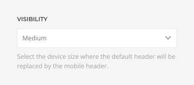
Define the device size at which the desktop header is replaced with the mobile header. The breakpoint depends on the number and size of navbar items. Use the device preview buttons to see how the site looks on different device widths.
| Visibility | Description |
|---|---|
| None | Do not show the mobile header. |
| Small | Show the mobile header if the device width is below 640px. |
| Medium | Show the mobile header if the device width is below 960px. |
| Large | Show the mobile header if the device width is below 1200px. |
Header Layout
Positions
Select the layout for the mobile logo, navbar and header positions.
| Position | Color | Description |
|---|---|---|
| Logo | Black | Displays the logo as well as the logo-mobile module position |
| Navbar | Green | Displays the navbar-mobile menu location and module position |
| Header | Purple | Displays the header-mobile menu location and module position |
Learn how to publish menus and modules in the menus and modules documentation.
Optionally, remove the logo padding for layouts where logo is positioned on the left, for example, for logos with colored backgrounds.

Horizontal Layouts
The logo as well as the navbar and header positions are displayed side by side, from left to right with different alignments.
Navbar
There are three options available to control the mobile navbar position and its behavior.
| Option | Description |
|---|---|
| Static | The navbar will move out of the viewport on scrolling. |
| Sticky | The navbar will stick at the top of the viewport on scrolling. |
| Sticky on scroll up | The navbar will move out of the viewport when scrolling down, and it will become sticky on scrolling up |
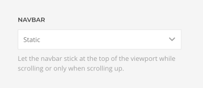
Note If a transparent header is set on a section, the Sticky navbar will show up once you have scrolled bellow the hero section, and it will hide when the hero section comes into the viewport.
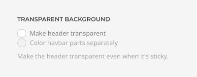
Make the header transparent and overlay the background of the site on all pages and even when it's sticky. The header will automatically change its text color depending on its background. Optionally, color navbar parts separately.
Dialog Layout
In addition to the header layout, YOOtheme Pro can display menus and modules published in the mobile dialog module position in a dropbar, offcanvas sidebar or modal window. The dialog is opened by clicking a toggle icon which automatically appears in the mobile header.
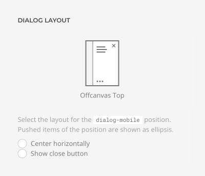
Select the layout for the dialog-mobile position. Items which can be pushed are shown as ellipsis.
Dropbar Layout
The dropbar stretches to the full width and height of the viewport but does not overlay the navbar. Navbar items remain clickable when the dropbar is open. Items are displayed at the top or in the center of the dropbar.
Offcanvas Layouts
The offcanvas sidebar overlays the navbar. Items are displayed at the top or in the center of the offcanvas sidebar.
Modal Layouts
The modal window overlays the navbar. Items are displayed at the top or in the center of the modal window.
Alignment and Close Button
All layouts have an option to center their content horizontally. Additionally, show or hide the close button for the offcanvas and modal layouts.
Dialog Push Items
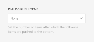
Dialog layouts have an option to push modules published in the mobile dialog position to the bottom of the layout. Just set the number of items after which the following items are pushed to the bottom.
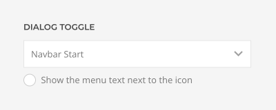
Dialog Toggle
Select the position for the dialog toggle. Optionally, show the Menu text next to the icon.
Dropbar Animation
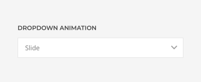
There are additional options for the Dropbar layouts.
| Option | Description |
|---|---|
| Fade | The dropbar fades in. |
| Slide Top | The dropbar slides in from the top revealing its content. |
| Slide Left | The dropbar and its content slide in from the left. |
| Slide Right | The dropbar and its content slide in from the right. |
Offcanvas Mode
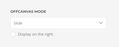
There are additional options for the Offcanvas layouts.
| Option | Description |
|---|---|
| Slide | The offcanvas bar slides on top of the page content. |
| Reveal | The page content moves out of the viewport revealing the offcanvas bar underneath it. |
| Push | The offcanvas bar pushes the page content out of the viewport. |
Additionally, define if the offcanvas sidebar opens on the left or right.
Modal Width
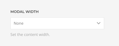
There is an additional option for the Modal layouts to define the width of the modal content.
Search
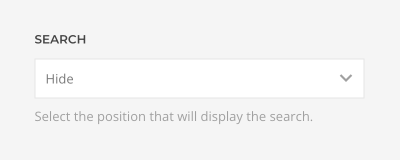
YOOtheme Pro allows publishing the search without having to create a Joomla module. Display the search in the start or end of the navbar-mobile, header-mobile or dialog-mobile position or at the end of the logo-mobile position. Alternatively, publish a search module on any available theme position.
Search Style
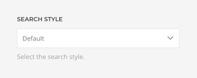
Choose between the Default and Modal search style. The Modal style only displays an icon. Clicking the icon will open a fullscreen modal with the search input box. This style is not available in the dialog-mobile module position.
Social Icons
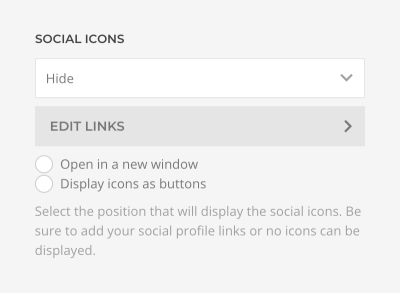
Display the social icons in the start or end of the navbar-mobile, header-mobile or dialog-mobile positions or at the end of the logo-mobile position.
Click the Edit Items button to add social icons. Each item has a Link, Icon and Image fields. If available, a corresponding UIkit brand icon will be displayed automatically. Links to Google Maps, email addresses and phone numbers, like mailto:info@example.com or tel:+491570156, are also supported. Alternatively, pick a different icon or an SVG image.
Define if the links should Open in a new window and whether to Display icons as buttons. Optionally, make SVG images stylable with CSS.
