Inverse Colors
Modify UI components to look great on light, dark or image backgrounds.
Every style you pick in the Style Customizer has either a light or a dark background by default, and all UI components and text colors have to be optimized for better visibility. The Inverse component ensures the same for inversed backgrounds. For light styles, it uses dark UI components and text colors, while for dark styles, light components are applied.
Inverse Component
To customize how UI components look on inversed backgrounds, open the Style → Inverse panel. The Inverse component contains all color-related options from other UI components and has its own set of global variables. Just like for the default style, adjust the global variables first, and you might not need to alter the single components.
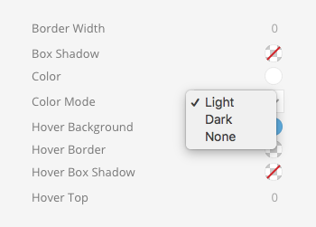
Color Mode
Components which serve as a content container and come with a background color offer a Color Mode setting in their sub-panel. Select a light or a dark color for their content. If you choose the same color the style uses as default, nothing has to be done technically because everything already looks great on the default background. But when choosing the inverse color, the Inverse component is extended internally and used as the style for the content.
Color Mode settings are available for the Section, Card, Tile, Overlay and Off-canvas components, usually for their Primary and Secondary modifiers.
Page Builder
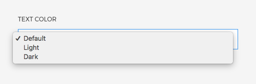
Thanks to the Inverse component and the Color Mode setting, content is automatically adapted for sections, cards and tiles. However, when selecting any background image, its main color scheme is unknown, and the text color has to be set manually. Therefore, whenever an image is picked in the Section or Row → Columns panel, a Text Color option appears.
| Option | Description |
|---|---|
| Default | Use the default color of the style. |
| Light | Force light text color no matter which style is picked. |
| Dark | Force dark text color no matter which style is picked. |
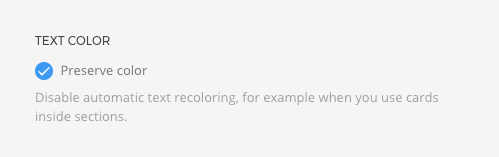
Preserve Color
Once the Inverse component is applied, whether by setting the Text Color or automatically through the Color Mode, it can't be reversed.
For example, a primary section often has a darker background and inverts the text color. This change cannot be reversed for any element inside said section. If a card is placed within this section, the text will still be light and unreadable on the light background of the card.
To prevent this, Primary and Secondary sections have an option to Preserve color. It disables the automatic text recoloring. If you have a card on the left side and a plain text that needs a light text color situated on the right side, you can set the Text Color just for the right column in the Row → Columns panel.